By Lily-Rose Bracken
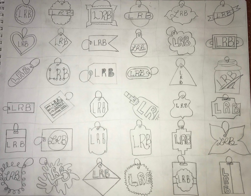
In these sketches, I was trying to achieve the most amount of variety that I could produce between each sketch. Prior research helped me to form ideas on the size and shapes of travel tags and labels. During this process, I struggled with showing variation in the font of my initials because I found it hard to do by hand. To solve this, I tried type such as bubble letters and cursive. If I had more time to work on these ideas and they weren’t just meant to be quick ideas put on the page, then I would add color and define the lines. Although Ive made other thumbnail sketches in the past, I really enjoyed this process and could see the benefits of it in fields such as graphic design. For designs such as these labels, the ideas that work most effectively become more clear and prominent when seen among others.

In this sketch, I was trying to reflect the texture of a leather tag with a buckle as the hook. I like that the tag was zoomed in because it gives a different perspective from the other labels and the viewer is able to see the texture.

The mixture between the curvy lines of the border with the lines of the font is a good example of showing similarity. There is a nice cohesiveness because of the similar texture used. This shape reminded me of the Nickelodeon logo and I enjoy how organic it is compared to the regular shapes of previous sketches.

PASS. Very nice splash tag. It would have been nice to see each one colored. Good exploration of different shapes and compositions.
LikeLike