By: Lily-Rose Bracken
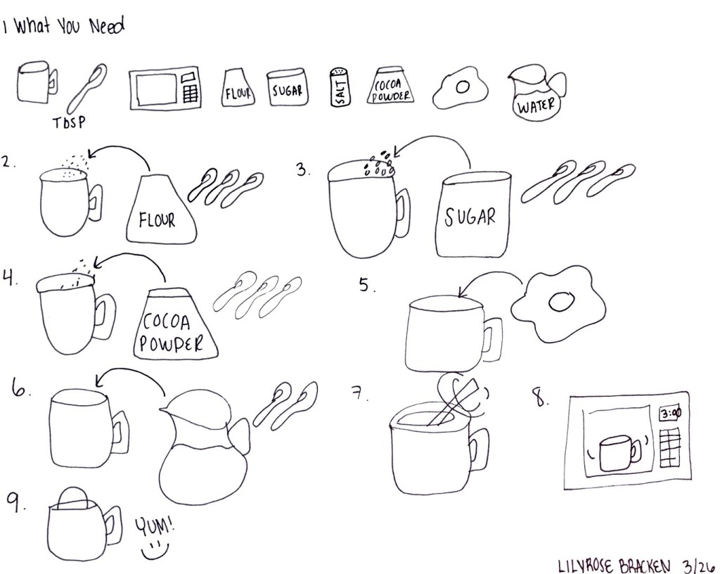
To find the mug cake recipe that I wanted, I first went to Pinterest. Pinterest is the first platform I go to for recipes, so I was certain it wouldn’t let me down. My thumbnail sketches kind of turned into a rough draft because once I started I had a pretty good idea of how I wanted to set up the page. With this rough sketch I knew I had to add color to clarify some of the ingredients and steps. In addition, it helped me realize that I needed to make the ingredients and mug big enough to be identified by children.
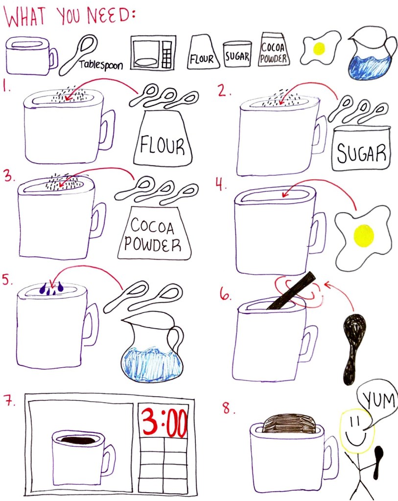
In my final diagram, I used arrows to indicate what ingredients were going into the mug and numbers to signal when. However, if I did this over I think I would have separated the steps by boxes rather than numbers for the intended audience. My AHA moment was realizing that arrows was the best symbol to show action into the cup. In addition, I added signs of movement such as for step number 6 to mix the I ingredients. I showed my diagram to my mom and she understood the steps but commented that the spoon in number 6 could be confused with trying to indicate a tablespoon. In that case, I could have made the spoon a different color than the tablespoons. If I had more time I would draw more details in all the objects to increase the chances of all children understanding this recipe.

PASS. This is excellent. Very clear. The only suggestion may be to change the representation of the egg from fried to raw. Other than that, it is nice to see a layout with big ingredients and clear measurements. Nice use of colors and as always, such beautiful outlines for the iconic representations. Sensory neurons are digging this recipe. Congratulations, you also receive a TOKEN for beautiful execution.
LikeLiked by 1 person