Lily-Rose’s Pottery Resume

Final Pottery Resume

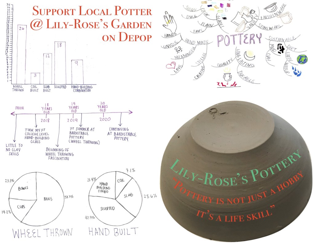
My hope is that people who have been interested in pottery see my graphs and are intrigued to start themselves. In addition I hope that viewers are intrigued enough to see the work that I have made based off my resume. My key message is that pottery is a skill that you acquire, as my quote refers to. Many people realize how difficult pottery is, especially wheel throwing, once they have tried it themselves. Not only is it hard to make pottery but also the technique of keeping the clay wet or dry and maneuvering around the kilns and glazes.

3 Thumbnail Sketches of Resume

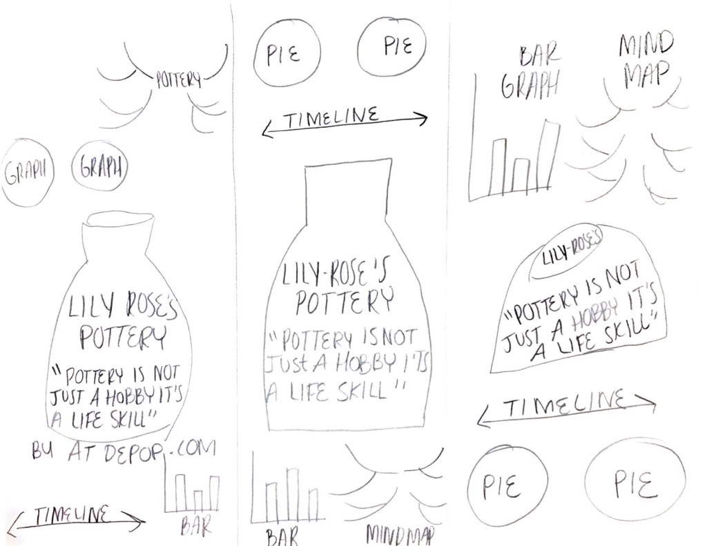
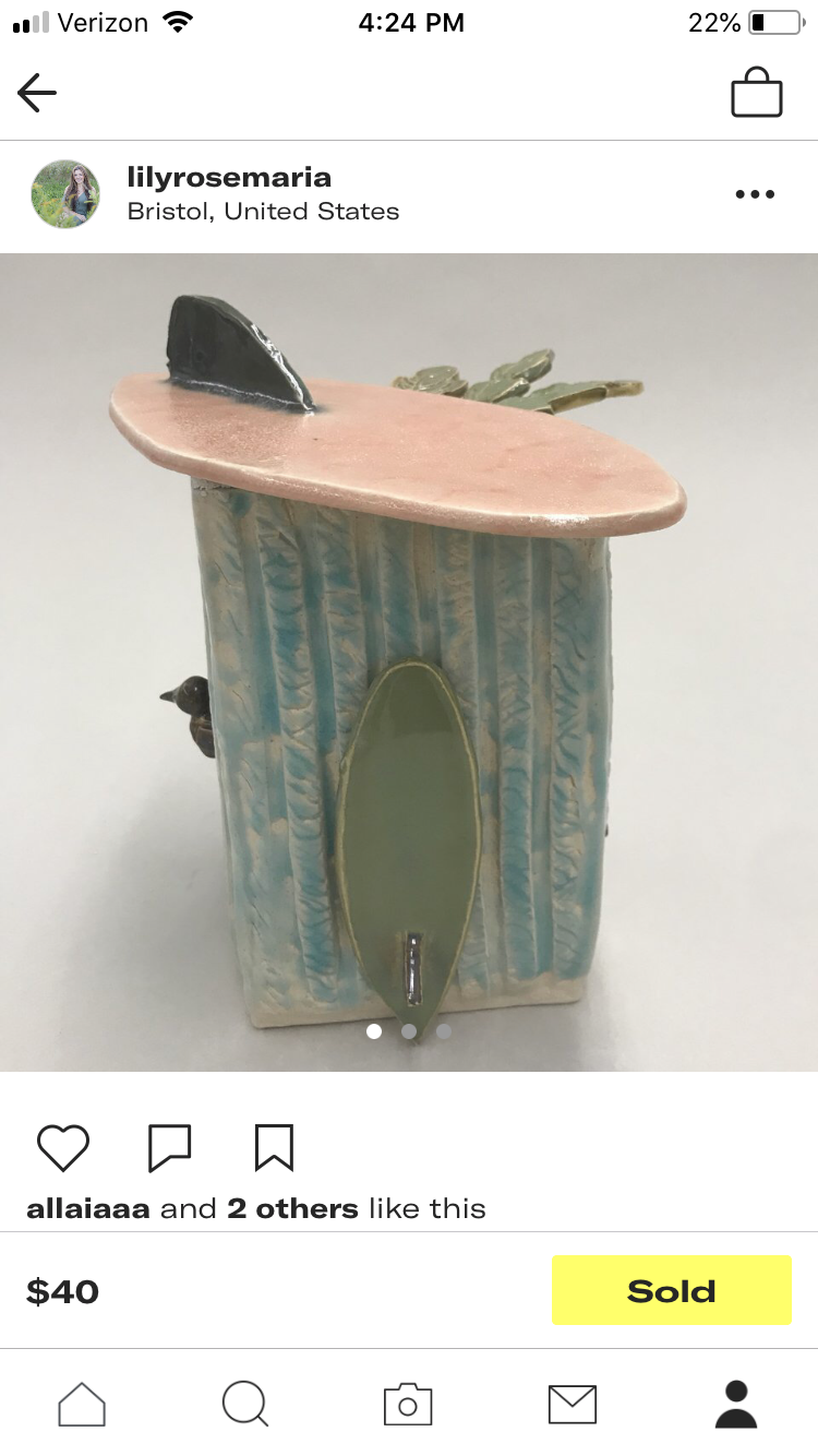
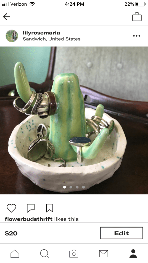
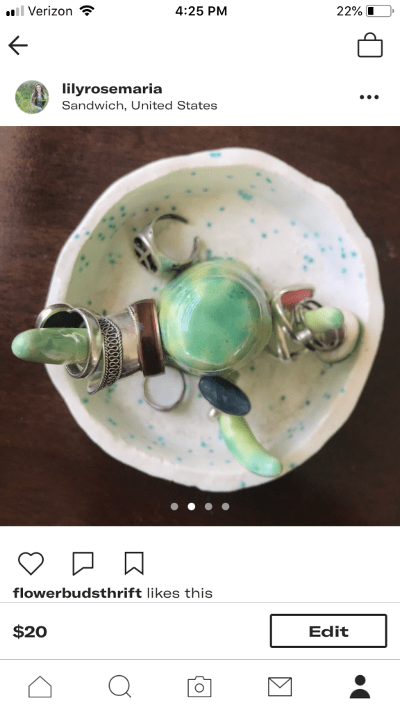
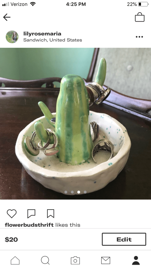
As shown even from my thumbnail sketches, I wanted the viewer to see the image of my piece first. From that, people will be drawn to the text on that image of pottery and then the similar text telling them to buy my pottery. After, they will be curious about what the information is explaining in the graphs and diagrams. If I were to redesign this I would have given the link to my Depop account, but at the time my username seemed best to put. I struggled with how long it took me to make the individual graphs and then put them all together. I had a hard time making space for everything on one page and was unsure at the beginning how to make all the diagrams readable.

My Online Shop

I have been selling items that I have made or thrifted on my Depop shop for the past year, available at https://depop.com/lilyrosemaria. It feels good knowing that people outside of my circle are able to see what I create and put a lot of time into. There is no better feeling than having someone like the work you produce so much that they want to purchase it themselves. Although validation of your work should never dictate the value of it, it sure helps to know that other people appreciate the artwork just as much. For example, it was a wonderful feeling selling the beach hut because I was able to share a piece of me to a complete stranger.

In the future, especially once the pandemic has subsided, I would like to create enough pieces to be able to sell my work at vendors. Right now, I mostly just have a few ceramic pieces on my shop but I would like to eventually put my paintings, drawings, and prints out there. Its difficult to not be able to work with pottery during this time (because I don’t have the equipment at home), but it’s made me appreciate what clay has brought into my life because of this experience. Ive learned that it’s okay to feel vulnerable with putting your work out for all to see because you can’t lose anything from it. It’s okay to not get the reaction you were expecting from viewers because everyone perceives art in different ways and some work strikes some people more than others.

Easy Chocolate Mug Cake Recipe

By: Lily-Rose Bracken

Practice Mug Cake Recipe Thumbnails

To find the mug cake recipe that I wanted, I first went to Pinterest. Pinterest is the first platform I go to for recipes, so I was certain it wouldn’t let me down. My thumbnail sketches kind of turned into a rough draft because once I started I had a pretty good idea of how I wanted to set up the page. With this rough sketch I knew I had to add color to clarify some of the ingredients and steps. In addition, it helped me realize that I needed to make the ingredients and mug big enough to be identified by children.

Final Mug Cake Recipe

In my final diagram, I used arrows to indicate what ingredients were going into the mug and numbers to signal when. However, if I did this over I think I would have separated the steps by boxes rather than numbers for the intended audience. My AHA moment was realizing that arrows was the best symbol to show action into the cup. In addition, I added signs of movement such as for step number 6 to mix the I ingredients. I showed my diagram to my mom and she understood the steps but commented that the spoon in number 6 could be confused with trying to indicate a tablespoon. In that case, I could have made the spoon a different color than the tablespoons. If I had more time I would draw more details in all the objects to increase the chances of all children understanding this recipe.

Walking Map

By Lily-Rose Bracken

Map from My House to East Sandwich Beach

For this map I chose to draw directions from my house to East Sandwich beach. This is my favorite beach to go to in the summer because not to many tourists know about it, so it is mainly locals. This year the beach has become even more significant to me because my brother recently moved on the road that the beach is on with his girlfriend, which I depicted in the map. Some of the points that may be harder to recognize than others are the turns, but I tried to simplify the confusion by adding the street names facing where to turn. The struggle that I had with this map was reorganizing where the starting point was to have enough space for the other roads and turns. After playing around with pencil to sketch where everything should go, I decided to start in the top right corner because most of the turns were on the right hand side.

Close up of Landmarks

My favorite part of this map and when I physically take this route is driving over the Scorton Creek bridge. It is a very small bridge but people jump off during high tide and its always an enjoyable area. I used red to mark the path because viewers eyes will automatically be drawn to the color and follow it. I showed one of my friends from home my map and she understood each step, it probably also helps that she is familiar with the area.

Thumbnail Sketches

By Lily-Rose Bracken

All Thirty-Six Sketches

In these sketches, I was trying to achieve the most amount of variety that I could produce between each sketch. Prior research helped me to form ideas on the size and shapes of travel tags and labels. During this process, I struggled with showing variation in the font of my initials because I found it hard to do by hand. To solve this, I tried type such as bubble letters and cursive. If I had more time to work on these ideas and they weren’t just meant to be quick ideas put on the page, then I would add color and define the lines. Although Ive made other thumbnail sketches in the past, I really enjoyed this process and could see the benefits of it in fields such as graphic design. For designs such as these labels, the ideas that work most effectively become more clear and prominent when seen among others.

Thumbnail Sketch Detail

In this sketch, I was trying to reflect the texture of a leather tag with a buckle as the hook. I like that the tag was zoomed in because it gives a different perspective from the other labels and the viewer is able to see the texture.

Thumbnail Sketch Detail

The mixture between the curvy lines of the border with the lines of the font is a good example of showing similarity. There is a nice cohesiveness because of the similar texture used. This shape reminded me of the Nickelodeon logo and I enjoy how organic it is compared to the regular shapes of previous sketches.

5 Sensory Photos from the Environment

Sensory Principle – Color

Walking around campus, it was interesting to get closer to the surroundings that I walk past everyday. Even though I walk pack the environment and objects in these pictures at least once a day, I was able to see my surroundings from a different perspective. I was trying to achieve getting close enough to the subject that the overall item of interest remained unknown, while still delivery the sensory principle that was sticking out to me. I picked this moss on the tree because of how many variations of colors the trunk obtained. I see various hues of green, brown, white, gray, and yellow.

Sensory Principle – Shape

Unlike some of my other pictures, this one immediately stuck out to me as a good example of using the shape sensory principle. Almost instantly, the white shapes jumped out at me as clouds in the sky. The contrast of the black background with impurities highlights the white figures. In reality, this is a zoomed up picture of the bottom of a light post that has paint chipping off.

Sensory Principle – Line

This image is one of the more recognizable, but the viewer is surrounded by repeated lines while looking at the picture. I helped solve my problem of knowing too much about the subject of this photo by cropping the image. The texture of each strand intensifies the depth and seems as though these lines could go on forever. I imagine being in the middle of a cornfield while looking at this.

Sensory Principle – Relative Size

While looking through my photos, trying to find the one that best portrayed relative size, I had an AHA moment with this one. At first this was not one of my favorites, but then I realized that the zoomed up leaf looks relatively large in comparison to the reflection of my head and body in the puddle. It seems as though if the camera were to back up the leaf and figure would be the same size. I also appreciate the color and texture in the background, made by the pavement.

Sensory Principle – Division of Space (Structure)

Lastly, division of space was demonstrated through the design of an outdoor trashcan. The structure of the trashcan has protruding bars that form around the body of the can. The outside layers of bars provide shade for the background can, which creates a difference in the saturation of the color black.

Lily-Rose’s Mind Map

At the start of the map process, there was one thought that kept reoccurring in my head, so I deemed it most beneficial for me to write about. Something that has been laying around in my subconscious the decision to live on or off campus next year. When starting this map I was already leaning towards wanting to be off campus, but this thought process helped me through the steps of feeling reassured by my decision. The words flowed out, as many of my worries had correlations and were a result of each other.

Naturally, many images came into my head during the process of writing out key words. Some of the images have more personal ties, while others are what most viewers would associate with the terms. I thought the use of the negative red and positive green colors associated with “on” and “off” would naturally attract the viewer.

Since I knew I was leaning towards one side, I decided to narrow the process down to the pros and cons of moving off campus. Now knowing and being familiar with most of the terms, I was able to organize the layout in a less confusing manner. The use of sharpie helped project the words off the page.

Becoming more confident in the positives of living off campus, I could also visually see that most of the key words were placed in the pros. Some of the same images appeared, as they were the most frequent image in my mind even by the second map.

An Original

Made by Lily-Rose Bracken

Recently, I got sick with the flu, which originally influenced this illustration. I started the drawing with the protective mask because that is what I was given at the doctors office. These simple masks have a way of making you feel like an outcast, by attracting negative attention. It’s hard to believe that many people walk around normally with protective masks in places like China. This ignited my thoughts about the Coronavirus and how fast germs can be spread. Luckily, vaccines for viruses such as the flu have been developed, but it makes me wonder if there will someday be a vaccination for the Coronavirus. And if so, how effective will the vaccine be? The flu vaccine has been proven to have exceptions of receivers still acquiring the virus. However, if people like me had gotten the flu shot I bet my chances for getting the flu would have been significantly slimmer. The media is constantly throwing out places where vaccines are available, specifically for the flu shot. Essentially, the message I’m trying to convey in this illustration is to be aware of the illnesses surrounding you and ways to help protect yourself. Being our own best advocates for our bodies is the smartest way to stay healthy. I drew a stick figure in distress to illustrate how getting sick affects the entire body, which is fighting to get rid of the bacteria. I pictured kleenex because that is what I went through the most while having the flu. This also brought to my attention the impact on the environment that kleenex alone has, especially during the cold season. 

Design a site like this with WordPress.com
Get started